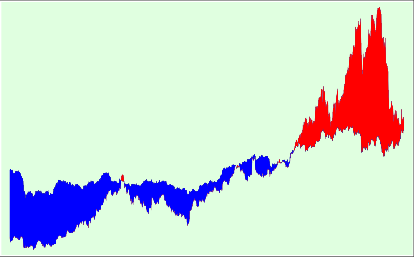
This picture is a comparison performance-graph of two stocks over a three-year period. I've removed all axes-information to bring it into the realm of the purely visual. The two stocks are IBM and Apple; the time frame, recent. Where the value of an IBM share exceeds that of Apple, the difference is blue; where the value of an Apple share exceeds that of IBM, the difference is red. Mathematica 6 makes all this fairly easy: I started with a simple stock performance graph as given in the Mathematica Demonstration Center's basic examples for either the DateListPlot or FinancialData function, added the second stock graph to the plot and figured out how to do the color-filling between them (from an example in Applications for the Filling function). A little fiddling to remove the axes information, get an exact three-year period (ending in the present), color the background and frame the result. Select, save as png, import into my web-development app, add this text and publish. The picture should make you want to ask: Are we about to see blue again? The full Mathematica code is:
p=Take[DateList[], 3] - {3, 0, 0}; Framed[DateListPlot[{FinancialData["IBM", p], FinancialData["AAPL", p]}, Joined->True, Axes->False, Frame->False, Background->LightGreen, Filling->{1->{{2}, {Red, Blue}}}]]
![]()
7 March 2008 © Rarebit Dreams